
Michaels App Redesign
A streamlined (and coupon-savvy) update to the retail giant’s mobile app.


Duration
Oct - Dec 2024
Team
Isabella Angelucci
Ashley Helm
Gabrielle White
Caitlin Pichette
Group Tasks
User Research
Heuristic Evaluation
Solo Tasks
User Testing
Interface Design
Branding
Tools
Figma (wireframing, prototyping)
Illustrator (iconography)
Dotted Paper (wireframe sketches)
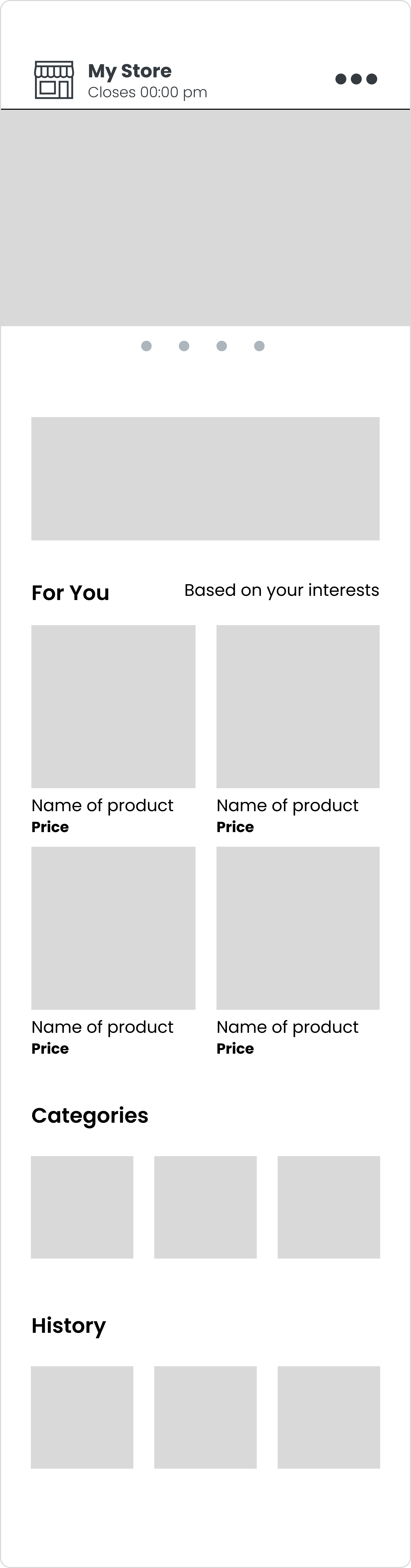
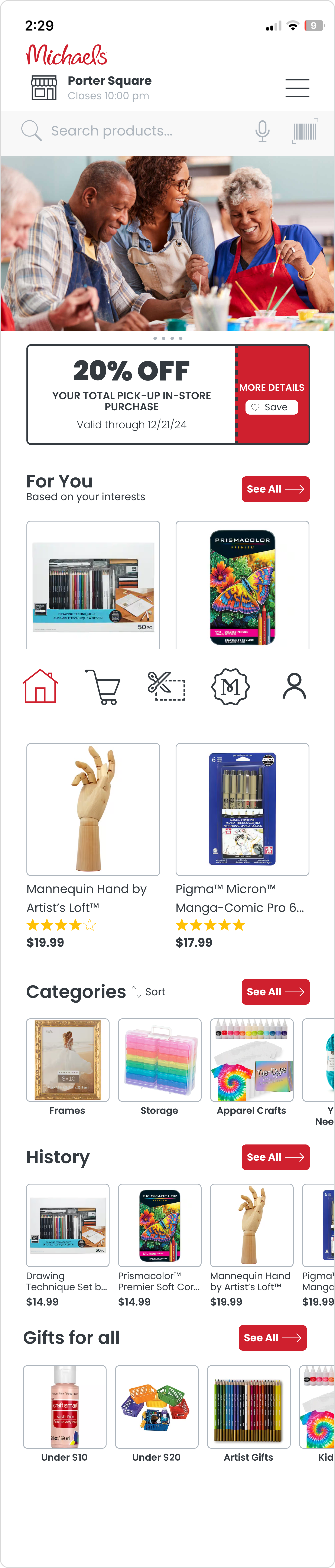
The Problem
The current design of the Michaels app is widely perceived as chaotic and overwhelming to users. A variety of reasons are for this including information overload, many visual inconsistencies, poor content prioritization and minimal disability assistance.
Competitor Analysis
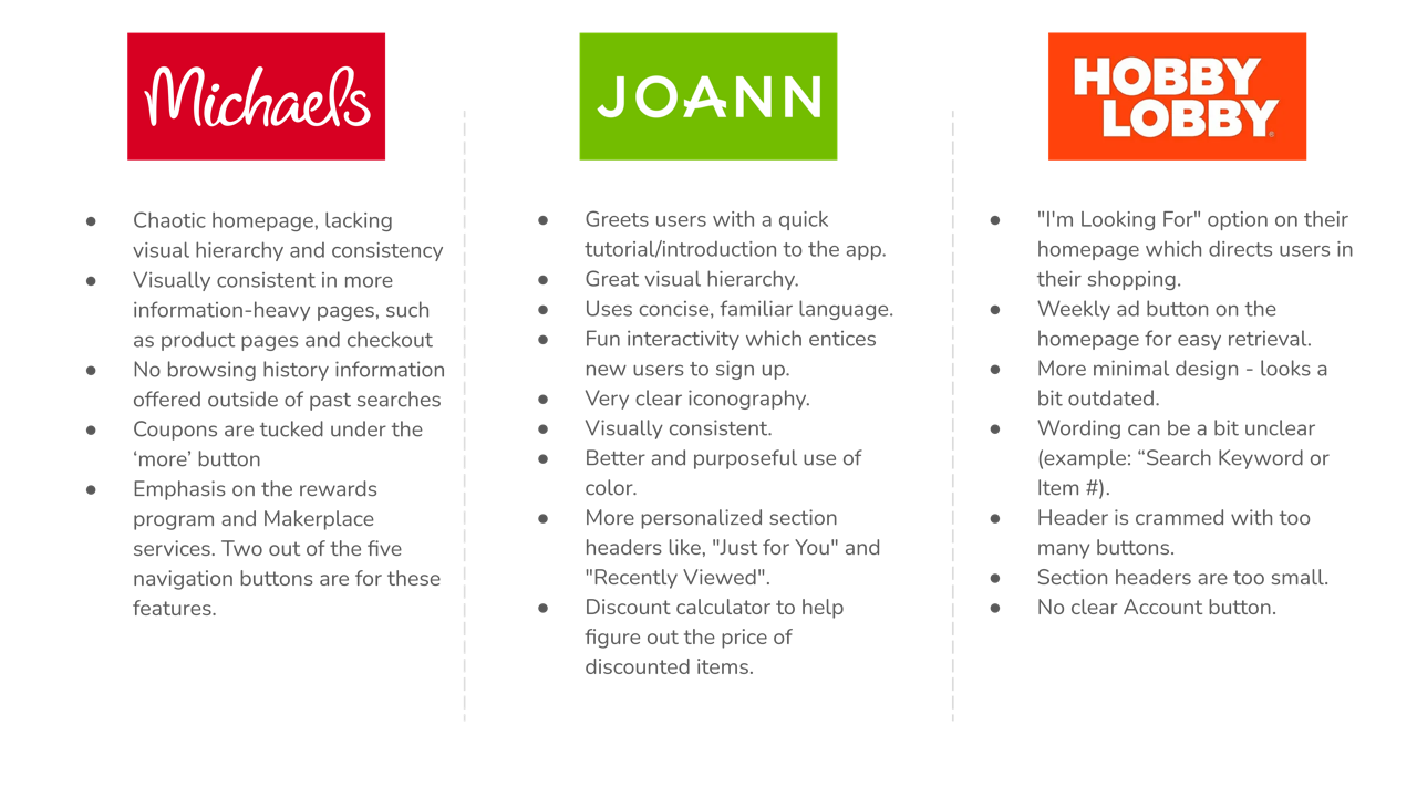
We compared Michaels mobile interface to JOANN and Hobby Lobby’s counterparts. While Michaels had the best layout for information-heavy pages, JOANN stood out for it’s thoughtful design, onboarding flow and personalization options. Hobby Lobby offered some unique features such as the “I’m looking for” button, but ultimately shared similar navigation issues with Michaels.
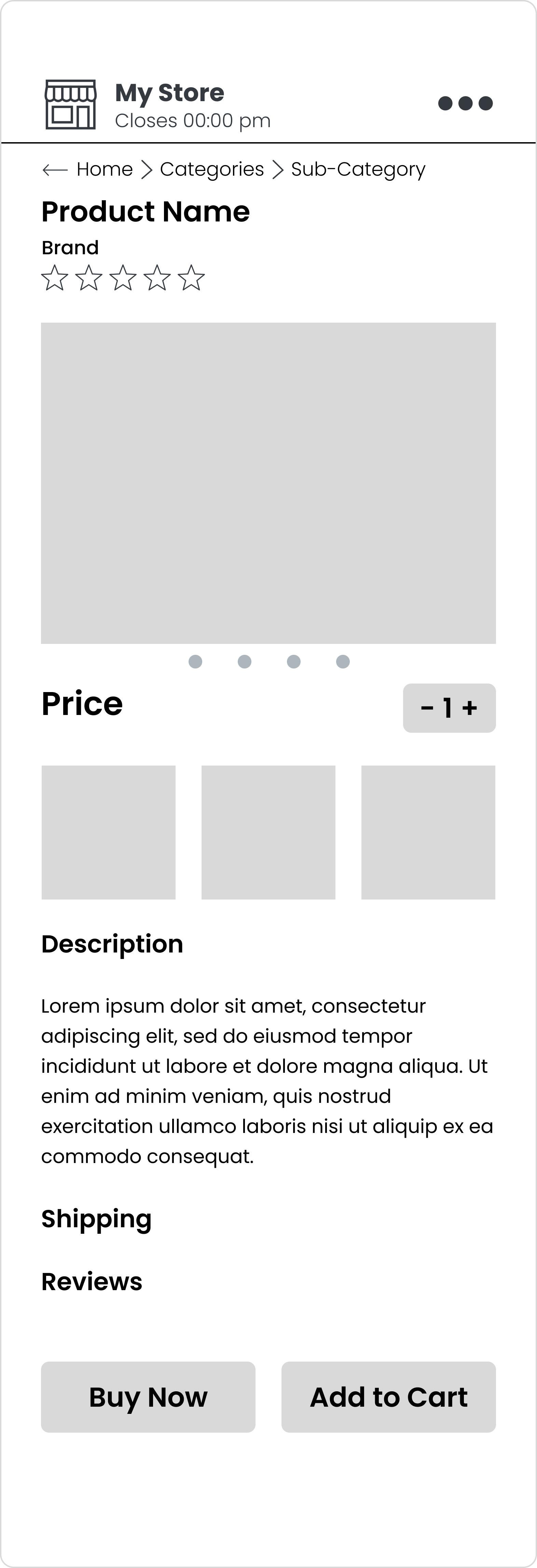
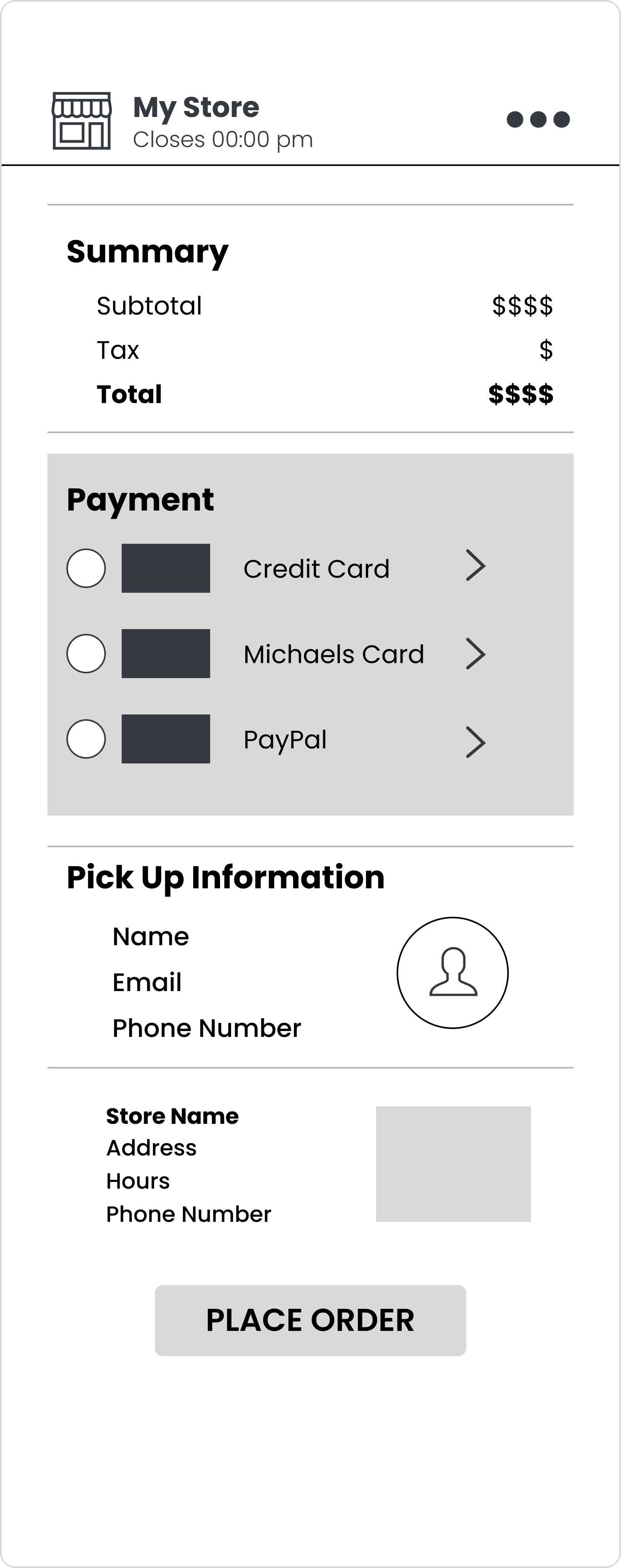
User Testing
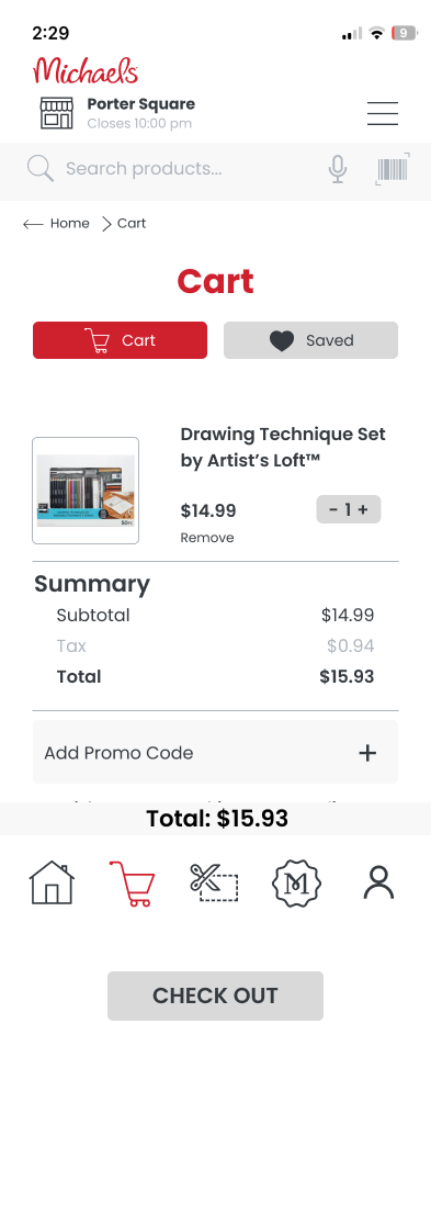
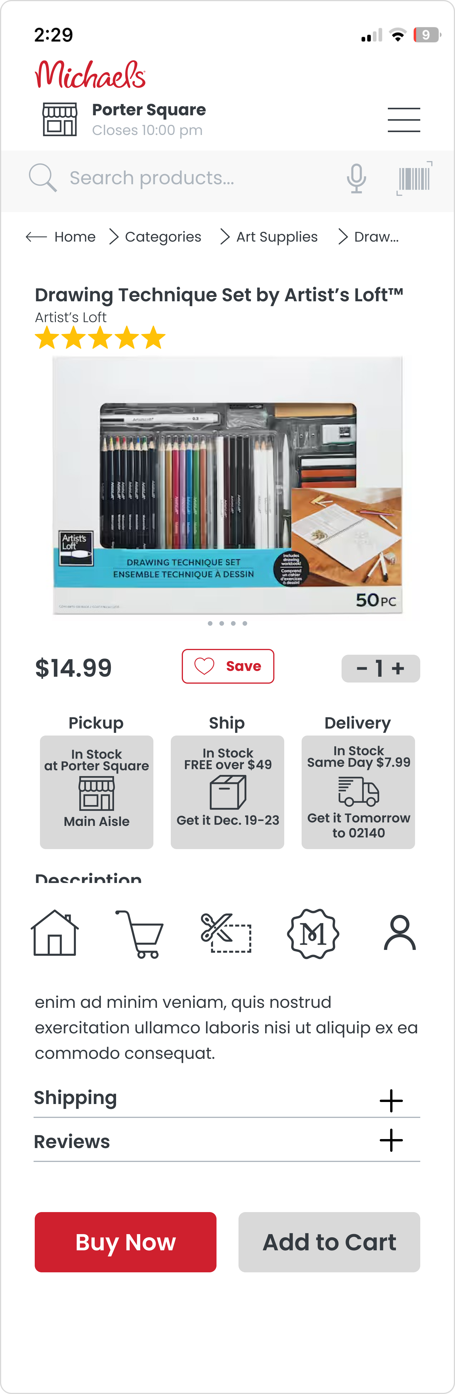
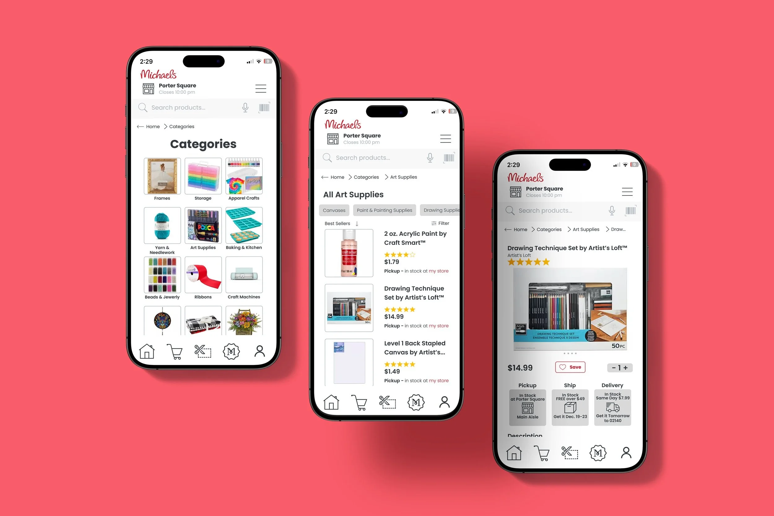
I drew out wireframes and developed a lo-fidelity prototype in Figma before working on the final prototype. Both my parents as well as my sister volunteered to test out each iteration. When I did the low fidelity tests, I first instructed the participant to navigate around the real Michaels app and share their thoughts. I then introduced my design - first presenting my sketches and then pulled up the prototype on my laptop. I texted the mobile prototype link to each participant and had them test out the prototype on their phones.
While I’m glad that I had participants of different ages test out the prototype, I would have tried to cast a more diverse net. I had my family participate primarily due to convenience and time constraints, but having participants of differing backgrounds and identities is well worth the diverse feedback.